Priority Badges Setup Guide#
This guide shows you how to enable and use priority badges in your MkDocs documentation site.
What You Get#
Priority badges automatically display on requirement pages, showing:
- ✅ Priority level (CRITICAL, HIGH, MEDIUM, LOW) with color-coded badges
- ✅ Phase number (1-7) for implementation tracking
- ✅ Status (Draft, In Review, Approved, Implemented)
Visual Preview#
On Requirement Pages#
When you view a requirement page, badges appear right after the title:
Visual appearance:
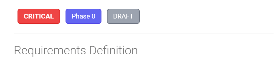
The CRITICAL badge appears in red, Phase in blue, and Approved (status) in green.
Color Scheme#
| Priority | Color | When to Use |
|---|---|---|
| CRITICAL | 🔴 Red | Foundation features blocking other work |
| HIGH | 🟠 Orange | Core functionality needed for MVP |
| MEDIUM | 🟡 Yellow | Important features that can be phased |
| LOW | 🟢 Green | Nice-to-have, deferred to later |
On Index Pages#
The requirements index shows all requirements in cards with badges:
┌─────────────────────────────────────────────────────────┐
│ Plant Database              [CRITICAL] [Phase 1]        │
├─────────────────────────────────────────────────────────┤
│ Plant data model, storage, and basic display.           │
│ Foundation for entire system.                           │
│                                                         │
│ View Requirement →                                      │
└─────────────────────────────────────────────────────────┘
Setup Instructions#
Step 1: Files Already Created ✅#
These files have been created for you:
docs/stylesheets/priority-badges.css- Badge stylingdocs/hooks/priority_badges.py- Auto-injection hookdocs/rules/requirement-metadata-guide.md- Usage guidemkdocs.yml- Already configured
Step 2: Update Requirement Template#
Add YAML front matter to your requirement files:
---
title: "Plant Database"
req_id: "req-general-user-plant-database"
priority: "CRITICAL"
phase: "1"
status: "approved"
created: "2025-01-15"
updated: "2025-01-27"
author: "Kassandra Keeton"
maps_to_req000: "System.GenUser.ViewsAndInsights.PlantDatabase"
---
This is already in the template at docs/templates/requirements-template.md!
Step 3: Build and View#
# Serve locally to preview badges
mkdocs serve

# Build for production
mkdocs build

# Deploy to GitHub Pages
mkdocs gh-deploy
Step 4: View Example#
Visit the example page to see badges in action:
- Local:
http://localhost:8000/requirements/requirements-index-example/ - Live:
https://prosperousheart.github.io/gardening-app/requirements/requirements-index-example/
How It Works#
Automatic Badge Injection#
There are 2 approaches: Hook vs Macros
Known Issue: Hook May Not Work on All Files
The Python hook approach works on some files but not on REQ-000 files. The root cause is unknown. We currently use the macros plugin approach as a workaround.
Approach 1: Python Hook (Intended, But May Not Work)#
The priority_badges.py hook is supposed to:
- Read the YAML front matter from requirement files
- Detect priority, phase, and status values
- Inject HTML badges after the first H1 heading
- Style badges using
priority-badges.css
Issue: For unknown reasons, badges don't appear on REQ-000 files even though the hook runs.
Approach 2: Macros Plugin (Current Workaround)#
Requirements: - mkdocs-macros-plugin must be enabled in mkdocs.yml - Jinja2 template code must be directly in each file (NOT via snippets!)
How it works:
- YAML Front Matter - Metadata at top of file
- Jinja2 Template - Reads metadata and generates HTML
- Macros Plugin - Processes Jinja2 during build
- CSS Styling -
priority-badges.cssstyles the badges
CRITICAL: Snippets + Jinja2 Don't Work
Execution order:
- ✅ Markdown extensions (including
pymdownx.snippets) run FIRST - ✅ Plugins (including
mkdocs-macros-plugin) run SECOND
If you include Jinja2 via snippets, it becomes literal text before the macros plugin runs. You'll see raw {% if page.meta.priority %} on the page.
Solution: Put Jinja2 code directly in each requirement file.
Example Transformation#
Before (markdown):
After (rendered HTML):
<h1>Plant Database</h1>

<div class="requirement-badges">
  <span class="priority-badge priority-critical">CRITICAL</span>
  <span class="phase-badge">Phase 1</span>
  <span class="status-badge status-approved">Approved</span>
</div>

<p>Plant data model...</p>
Macros Approach Template#
Complete example with Jinja2 template:
---
priority: "CRITICAL"
phase: "1"
status: "approved"
---

# Plant Database

{% if page.meta.priority %}
<div class="requirement-badges">
<span class="priority-badge priority-{{ page.meta.priority | lower }}">{{ page.meta.priority }}</span>
{% if page.meta.phase %}<span class="phase-badge">Phase {{ page.meta.phase }}</span>{% endif %}
{% if page.meta.status %}<span class="status-badge status-{{ page.meta.status | replace(' ', '-') | lower }}">{{ page.meta.status | replace('-', ' ') | title }}</span>{% endif %}
</div>
{% endif %}

Plant data model, storage, and basic display.
This template:
- Checks if
page.meta.priorityexists - Generates priority badge with correct CSS class (lowercase)
- Conditionally adds phase and status badges if present
- Uses Jinja2 filters for formatting
Creating a Requirements Index#
You can create an auto-generated requirements index:
Option 1: Manual Index (Simple)#
Create docs/requirements/index.md:
# Requirements Index

## Phase 1: Core Plant Database

- [Plant Database](req-general-user-plant-database.md) - CRITICAL
- [Plant Search](req-general-user-plant-search.md) - CRITICAL
Option 2: Python Script (Advanced)#
Create a script to auto-generate the index:
#!/usr/bin/env python3
"""Generate requirements index from YAML front matter."""

import yaml
from pathlib import Path

def generate_index():
    req_dir = Path("docs/requirements")
    requirements = []

    # Read all requirement files
    for req_file in req_dir.glob("req-*.md"):
        with open(req_file, "r") as f:
            content = f.read()

            # Extract YAML front matter
            if content.startswith("---"):
                yaml_end = content.find("---", 3)
                yaml_content = content[3:yaml_end]
                metadata = yaml.safe_load(yaml_content)

                requirements.append({
                    "file": req_file.name,
                    "title": metadata.get("title"),
                    "priority": metadata.get("priority"),
                    "phase": metadata.get("phase"),
                    "status": metadata.get("status"),
                })

    # Sort by phase, then priority
    priority_order = {"CRITICAL": 0, "HIGH": 1, "MEDIUM": 2, "LOW": 3}
    requirements.sort(
        key=lambda r: (int(r["phase"]), priority_order.get(r["priority"], 4))
    )

    # Generate markdown
    output = ["# Requirements Index\n"]

    current_phase = None
    for req in requirements:
        phase = req["phase"]
        if phase != current_phase:
            output.append(f"\n## Phase {phase}\n")
            current_phase = phase

        output.append(
            f'- [{req["title"]}]({req["file"]}) '
            f'<span class="priority-badge priority-{req["priority"].lower()}">'
            f'{req["priority"]}</span>\n'
        )

    # Write index file
    with open("docs/requirements/index.md", "w") as f:
        f.write("".join(output))

    print("✅ Generated docs/requirements/index.md")

if __name__ == "__main__":
    generate_index()
Run before building:
Option 3: MkDocs Plugin (Most Advanced)#
Install mkdocs-macros-plugin:
Configure in mkdocs.yml:
Create docs/macros/requirements_index.py:
def define_env(env):
    """Define macros for MkDocs."""

    @env.macro
    def requirements_by_priority(priority):
        """Get all requirements with given priority."""
        requirements = []
        # ... (similar logic to script above)
        return requirements
Use in markdown:
# Critical Priority Requirements

{% for req in requirements_by_priority("CRITICAL") %}
- [{{ req.title }}]({{ req.file }})
{% endfor %}
Customization#
Change Badge Colors#
Edit docs/stylesheets/priority-badges.css:
/* CRITICAL - Change red to a different color */
.priority-critical {
    background-color: #dc2626;  /* Change this */
    color: #ffffff;
    border: 2px solid #b91c1c;  /* And this */
}
Add New Statuses#
Add new status badge styles:
Then use in YAML:
Add Icons to Status Badges#
By default, status badges show text only (e.g., "Draft", "Approved"). You can add icons to make them more visual.
What you get:
- 🎨 Draft - Paintbrush icon
- 👥 In Review - People icon
- ✅ Approved - Verified (checkmark with badge) icon
- 🚀 Implemented - Rocket icon
How it works:
Icons are defined in docs/stylesheets/priority-badges.css using SVG data URIs with CSS mask-image. This approach:
- ✅ Icons inherit the badge's text color automatically
- ✅ Works in both light and dark mode
- ✅ No external image files needed
- ✅ Matches navigation status indicators (same icons in both places)
Example badge with icon:
<!-- Before: Text only -->
<span class="status-badge status-approved">Approved</span>

<!-- After: Icon + text -->
<span class="status-badge status-approved">✓ Approved</span>
Current implementation (lines 67-140 in priority-badges.css):
/* Status badges with icons */
.status-badge {
  display: inline-flex;
  align-items: center;
  gap: 0.375rem;  /* Space between icon and text */
  /* ... */
}

.status-badge::before {
  content: '';
  display: inline-block;
  width: 1em;
  height: 1em;
  background-color: currentColor;  /* Inherits badge text color */
  mask-size: contain;
  mask-repeat: no-repeat;
  mask-position: center;
  -webkit-mask-size: contain;
  -webkit-mask-repeat: no-repeat;
  -webkit-mask-position: center;
}

/* Draft - Paintbrush icon (Octicons paintbrush-16) */
.status-draft::before {
  mask-image: url('data:image/svg+xml;charset=utf-8,<svg xmlns="http://www.w3.org/2000/svg" viewBox="0 0 16 16"><path d="M11.134 1.535..."/></svg>');
  -webkit-mask-image: url('data:image/svg+xml;charset=utf-8,<svg xmlns="http://www.w3.org/2000/svg" viewBox="0 0 16 16"><path d="M11.134 1.535..."/></svg>');
}

/* Similar for other statuses (in-review, approved, implemented) */
To change icons (EASY - just update ONE line!):
Icons are defined as CSS custom properties in the :root selector at the top of priority-badges.css. To change an icon:
-
Find your new icon: Visit Octicons, Material Icons, or FontAwesome
-
Copy SVG code: Click "Copy SVG" for your chosen icon
-
Replace ONLY the custom property in the
:rootsection ofpriority-badges.css:
/* In docs/stylesheets/priority-badges.css */
/* Find the :root section and update the custom property */

:root {
    /* Just update THIS line - that's it! */
    --status-icon--approved: url('data:image/svg+xml;charset=utf-8,<svg xmlns="http://www.w3.org/2000/svg" viewBox="0 0 24 24"><path d="YOUR_NEW_SVG_PATH"/></svg>');
}
Available custom properties: - --status-icon--draft - Draft status icon - --status-icon--in-review - In Review status icon - --status-icon--approved - Approved status icon - --status-icon--implemented - Implemented status icon
- Rollback to original icons (optional):
Each custom property has commented-out alternatives showing the original icons:
:root {
    /* Current icon */
    --status-icon--draft: url('...');
    /* Original: Pencil icon (Octicons pencil-24) */
    /* --status-icon--draft: url('...'); */
}
To revert: uncomment the original, comment out the current.
- Save and rebuild:
Why this is better:
- ✅ Change once, apply twice - Custom property is used for both
mask-imageand-webkit-mask-image - ✅ All icons in one place - Easy to see and manage in the
:rootselector - ✅ Consistent with navigation icons - Same pattern used in
extra.cssfor navigation status indicators (see Navigation Status Indicators Tutorial) - ✅ Easy rollback - Commented-out original icons for reference
Technical Note: Multiple :root Selectors
Q: Does having :root in both extra.css AND priority-badges.css cause conflicts?
A: No! Both :root selectors are perfectly safe because:
:rootselectors merge - Multiple:rootblocks across CSS files all apply to the same element (<html>), and their properties combine- Custom property names are unique - No overlap:
extra.cssuses:--md-status--*(for navigation icons)priority-badges.cssuses:--status-icon--*(for page badge icons)- Each component uses its own properties - Navigation and page badges reference different custom properties
Think of it like this:
/* These two :root blocks... */
:root { --md-status--draft: url(...); }      /* in extra.css */
:root { --status-icon--draft: url(...); }    /* in priority-badges.css */

/* ...effectively become: */
:root {
    --md-status--draft: url(...);      /* navigation */
    --status-icon--draft: url(...);    /* page badges */
}
All properties coexist peacefully! 🎯
Why mask-image instead of background-image?
background-image: Icon would be a fixed color (doesn't respect theme)mask-image: Icon acts as a "stencil" and inherits the badge's text color automatically
Consistency with navigation:
The same icons are used in both places: - Navigation status indicators (docs/stylesheets/extra.css lines 131-171) - Page status badges (docs/stylesheets/priority-badges.css lines 67-140)
See also: Navigation Status Indicators Tutorial for the navigation implementation.
Badge alignment and interactions:
All badges use consistent CSS properties for proper alignment and hover effects:
/* Common properties for all badge types */
.priority-badge,
.phase-badge,
.status-badge {
    display: inline-flex;      /* Flexbox for better alignment control */
    align-items: center;       /* Vertically center content */
    flex-shrink: 0;            /* Prevent badge from shrinking */
    vertical-align: middle;    /* Align with surrounding text baseline */
}

/* Hover effects (all badges) */
.priority-badge:hover,
.phase-badge:hover,
.status-badge:hover {
    transform: translateY(-1px);      /* Subtle lift on hover */
    box-shadow: 0 4px 6px -1px rgba(0, 0, 0, 0.1),
                0 2px 4px -1px rgba(0, 0, 0, 0.06);
    transition: all 0.2s ease-in-out;  /* Smooth animation */
}
What each property does:
| Property | Purpose | Why It Matters |
|---|---|---|
display: inline-flex | Use flexbox layout | Better control over icon + text alignment |
align-items: center | Vertical centering | Ensures icon and text align on same baseline |
gap: 0.375rem | Space between icon/text | Consistent spacing (status badges only) |
flex-shrink: 0 | Prevent badge shrinking | Badges stay same size when container shrinks |
vertical-align: middle | Align with text | Badges align with surrounding paragraph text |
transform: translateY(-1px) | Lift badge on hover | Visual feedback when hovering |
box-shadow | Add depth on hover | Makes badge appear "raised" |
transition | Smooth animation | Hover effect animates smoothly (200ms) |
Why inline-flex instead of inline-block?
inline-block: Icon and text can misalign, especially with different font sizesinline-flex: Perfect alignment between icon and text, automatically centers content
Disable Badges for Specific Pages#
Step 1: Add to YAML front matter (same for both approaches):
---
title: "My Requirement"
priority: "CRITICAL"
show_badges: false  # Add this to disable badges
---
Step 2: Update implementation (differs by approach):
For Macros Plugin Approach (Current)#
Update the Jinja2 template in your requirement file:
{% if page.meta.priority and page.meta.get('show_badges', true) != false %}
<div class="requirement-badges">
<span class="priority-badge priority-{{ page.meta.priority | lower }}">{{ page.meta.priority }}</span>
{% if page.meta.phase %}<span class="phase-badge">Phase {{ page.meta.phase }}</span>{% endif %}
{% if page.meta.status %}<span class="status-badge status-{{ page.meta.status | replace(' ', '-') | lower }}">{{ page.meta.status | replace('-', ' ') | title }}</span>{% endif %}
</div>
{% endif %}
Change: {% if page.meta.priority %} → {% if page.meta.priority and page.meta.get('show_badges', true) != false %}
For Python Hook Approach#
Update priority_badges.py:
def on_page_markdown(markdown, page, config, files):
    # Check if badges are disabled
    if page.meta.get("show_badges") == False:
        return markdown
    # ... rest of code
Troubleshooting#
Badges Not Showing#
-
Check YAML front matter format:
-
Verify CSS is loaded:
- Open browser dev tools
- Check Network tab for
priority-badges.css -
Should return 200 status code
-
Check hook is running:
Badges Styling Wrong#
-
Clear browser cache: Ctrl+Shift+R (Windows/Linux) or Cmd+Shift+R (Mac)
-
Check CSS specificity: Your theme's CSS may override badge styles
-
Increase specificity:
Hook Not Running#
- Check file location:
- Should be
docs/hooks/priority_badges.py -
Not
hooks/priority_badges.py -
Check mkdocs.yml:
-
Restart MkDocs server:
- Stop: Ctrl+C
- Start:
mkdocs serve
Next Steps#
-
✅ View the example: Visit
/requirements/requirements-index-example/ -
✅ Create your first requirement: Use the template with YAML front matter
-
✅ Build the site: Run
mkdocs serveto see badges -
✅ Generate an index: Use one of the three options above
-
✅ Customize colors: Edit
priority-badges.cssto match your theme
Resources#
- CSS File:
docs/stylesheets/priority-badges.css - Hook File:
docs/hooks/priority_badges.py - Template:
docs/templates/requirements-template.md - Example:
docs/requirements/requirements-index-example.md - Metadata Guide:
docs/rules/requirement-metadata-guide.md
Questions? Check the Requirement Metadata Management Guide for details on using YAML front matter.